
Metallics can be great in theory and can heighten the quality of your brand's perception based on value… however it can do the complete opposite if you don’t have the money to back it up.


Metallics are something new business owners attach to, as they believe it symbolises wealth and high social status, however logistically it is something that is always hard for brands to manage. We highly recommend brands move away
In the world of branding, colour is one of the most powerful tools in a designer's arsenal. It evokes emotions, communicates values, and builds recognition. However, not all colours are created equal when it comes to effective branding. While metallic colours like gold, silver, and bronze might seem glamorous and luxurious, they can pose significant challenges when used as part of your brand’s core palette.
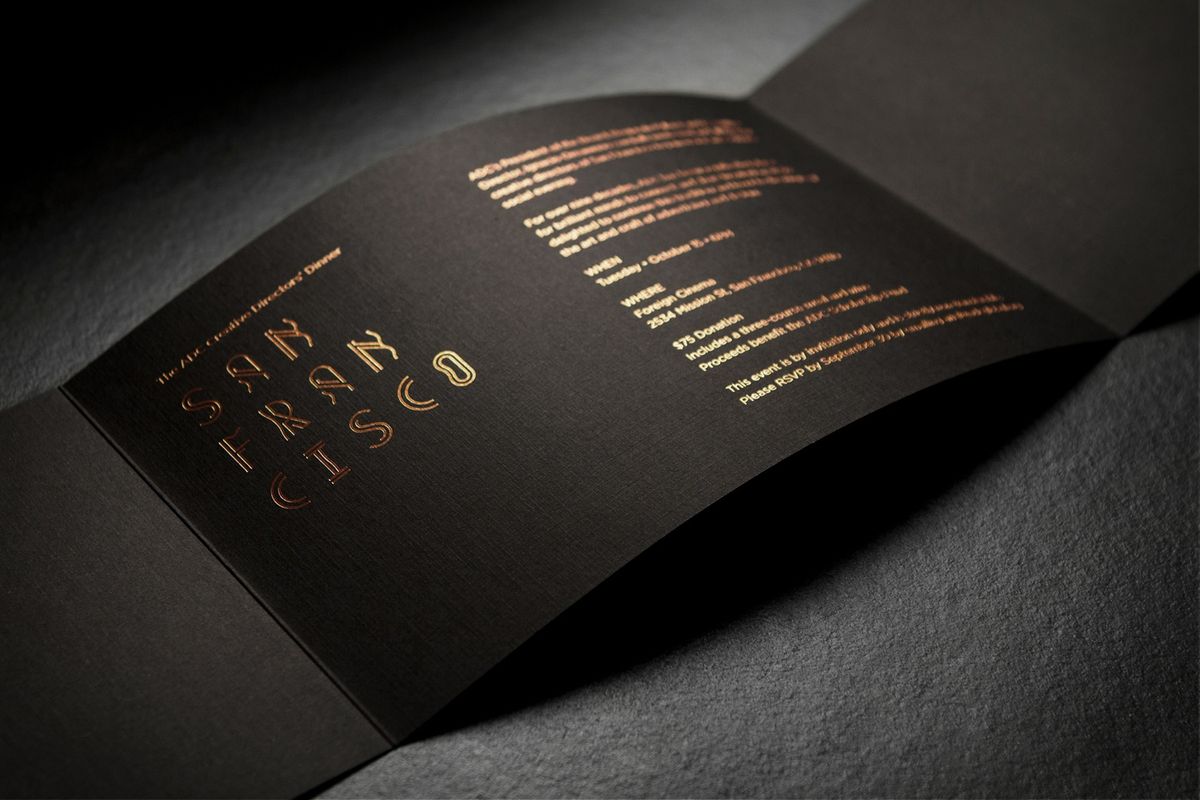
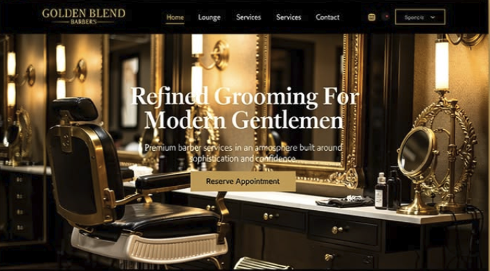
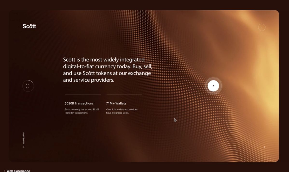
One of the biggest pitfalls of metallic colours lies in their inconsistency across different platforms. Metallic finishes rely on light reflections to achieve their characteristic shimmer, which is impossible to replicate accurately in many formats. For instance:
These inconsistencies can dilute your brand’s visual integrity and can work against your intent of having a brand that is perceived as luxurious as it transcends to your audience as cheap and tacky.
Brands that commit to metallic colours often face higher costs for everything from packaging to promotional materials. Metallic inks, foils, and finishes are premium options that break the budget—particularly if you require high-volume production. For smaller businesses or startups, these costs might outweigh the perceived benefits of using metallics especially when in particular small business may not have grand budgets.
Metallic colours can sometimes pose challenges for accessibility, particularly for individuals with visual impairments. When not paired thoughtfully with contrasting colours, metallic hues can make text and designs difficult to read. For example, light gold text on a white background might look elegant but can be nearly illegible for some viewers. This creates restrictions for your brand as 90% of the time you will see these colours on either true white, or true black.
Metallics have been overused in certain industries, particularly in luxury and premium markets. While gold and silver are often associated with opulence, they can also come across as clichéd or predictable if not implemented innovatively. For brands aiming to stand out, relying on metallics might inadvertently make them blend in. Brands such as Louis Vuitton and Saint Laurent have all used metalics for particularly their packaging in the past, however with an LVMH budgets they’re not short of a dime to fund for these finishes
If you’re drawn to the allure of metallics but want to avoid their pitfalls, consider these alternatives:
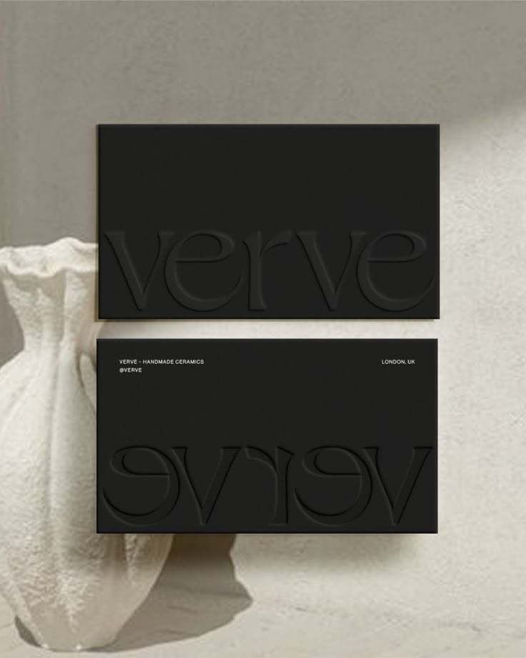
While metallic colours can add a touch of sophistication and glamour to a design, their practical drawbacks often outweigh their benefits in branding. Consistency, accessibility, cost, and sustainability are all crucial considerations for any brand aiming to establish a strong, timeless identity. By exploring alternative approaches, you can achieve the elegance and impact you desire without compromising your brand’s integrity.
We continually invest time in understanding contemporary trends that are used acorss a range of design diciplines including art, music, fashion, and architecture.
